This week we return to the USA, at least for a little while. Arkansas and Oregon will be the subjects, with a minor tweak for the former and three suggestions (though there are eight more) for the latter.
Arkansas is one of those flags that tripped at the finish line:
This could have been a great flag. The shapes are simple and evoke the diamond mines of the state, the four central stars are all about the history, the red field helps it stand out from it's 49 siblings, and it even lets them use some Confederate imagery without being too obvious about it. Why, oh why did they put the name in the middle?!
The blog I often think of as a predecessor, Your State Flag Stinks, did the expected and removed the name and enlarged and centered the stars:
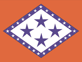
In the spirit of uniqueness (which I don't always follow, but will this time) I need to do something different and this is what I came up with:
The diamond shape is retained, along with the colors and the perimeter of stars, which denote Arkansas' place as the 25th state. In the original design (circa 1912) there were only three central stars with three different meanings: 1)The three nations to which Arkansas had belonged (Spain, France, USA), 2) 1803, the year of the Louisiana Purchase, of which Arkansas was a part, and 3) the fact that Arkansas was the third state admitted from the area that had been the Louisiana Purchase (Louisiana and Missouri were the first two). The fourth star was added in the 1920's and stood for a fourth nation, the CSA.
I like the three star design better, mostly because those stars can have three separate meanings, while with a fourth star they only have one. I filled in the white space because, I dunno, lots of flags have significant white space, and I thought it looked good. Plus, if you squint and use your imagination, those three stars are almost in the shape of an "A."
Oregon's flag is unique among (current) state flags in that it has different designs on the obverse and reverse sides. The front side is the typical seal on blue arrangement:
The use of only one color helps simplify it a bit, but the wagon train, eagle, date, and state name all combine to make this a pretty terrible flag. The one saving grace can be found on the reverse:
A friendly little beaver, all alone on the back of the flag. Again, only one color was a good decision, but the attempt at shading and detail only serves to detract from the design.
My original thought for Oregon was to use the flag of Portland, the state's largest city, which is pretty cool. It consists of distinct colors, a simple design, and no text or complicated imagery:
The colors here can stand for generic flag things (agricultural, mineral wealth, peace, rivers and oceans, etc.) and I was going to leave it at that, but then I discovered that the people of Oregon had already taken matters into their own hands. Back in 2008, to celebrate the sesquicentennial (150th) anniversary of the state, the Oregonian (a major newspaper in Portland) ran a contest for new flag designs. Sadly it wasn't recognized by the state government, but they still came up with some pretty neat ideas:
This was the winning design, a valiant effort which took the beaver, an important symbol of the state, and turned it into an appealing, four color design, vaguely reminiscent of Thailand or Costa Rica. The beaver is taken directly from the current flag and is a little busy for my taste, but it is head and shoulders above the original. It won the plurality, but with only 20% of the vote, it was hardly the clear victor. Most of the designs were good (though there was one that appeared to be mimicking Maryland's flag and wasn't able to pull it off) and I'd encourage everybody to take a look. My personal favorite came in a close second with 17% of the vote:
If you have read any other entries on this blog, you'll realize I'm a sucker for tree imagery on flags. Not sure why, but they just look good. This one could be simplified a little, but as the entrant described it, "Blue for our Pacific Coast, white for our snow-capped mountains, green for our forests and golden for the grassy plains of eastern Oregon." "Wish I'd thought of that," is about all I can say.


The 'gonian totally stole my idea:
ReplyDeletehttp://michael5000.blogspot.com/2008/01/flag-makeover-beaver-state.html
http://michael5000.blogspot.com/2008/02/new-flag-for-oregon-gallery.html
I would like to thank you for the attempts you've received developed in composing this report. I am hoping the identical greatest work from you inside of the potential also. Really your imaginative producing capabilities has inspired me to commence my individual Blog Engine weblog now.
ReplyDeleteCustom Flag
Advertising Flag