In a recent post over at Create/Recreate - Flags, etc., a blog with a similar purpose to this one and which is currently finishing a critique and improvement of the flags of the Brazilian states, the flag of the state of Rio Grande do Sul was examined:
This flag has the unfortunate attribute of showcasing the state seal, which in turn features the state's flag four times. I suppose this becomes an infinite regression, since each of those four flags would have the seal on them, which would each have four flags, which each have the seal, etc. The first thing that came to my mind when I saw this was the flag of Haiti:
As you can see, the coat-of-arms in the center of the flag makes the same mistake Rio Grande do Sul makes, but this time there are six flags instead of four. Like the old South African flag or the Georgian (US) flag of a few years ago, flag designs which prominently feature flags don't tend to be very successful.
I should reiterate at this point that any critiques I make of the flags of other nations are purely from a design perspective and in no way am I intending to insult or denigrate the ideas those flags may represent for other nations.
The Haitian flag is a nice one overall, and because the coat-of-arms is fairly small proportionally, this flag remains recognizable from a distance. It is very similar to the flag of Liechtenstein, a problem that was noticed at an early Olympics, but Liechtenstein decided to change their flag to avoid further confusion (they didn't make a big change, just added a crown to the upper-left corner). The imagery of the coat-of-arms is pretty good, but is also busy with lots of detail. This is what the coat-of-arms looks like enlarged:
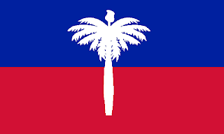
My favorite part of this coat-of-arms is the palm tree in the center, representative of the nation's climate and Caribbean location, which is topped by a Phrygian cap, a symbol (from Ancient Greece) of liberty. I've mentioned elsewhere how much I love the Phrygian cap as a symbol, but have never seen it utilized successfully on a flag. It usually shows up on seals as just another detail among many others. My idea to change the flag was to maintain the tree and cap, but remove the cannons, text, and especially the other flags. Here is what I came up with:
This flag keeps the red and blue background, as well as the symbolism of the cap and tree. The palm fronds could be simplified, but I kind of like the little detail that remains. It reminds me of the flag of South Carolina, which is one of the best American state flags even though the palmetto it features has a fair amount of detail.
Thanks to Leonardo for the inspiration for this post.
One last note on flags that feature flags. I have family in the Tampa Bay area of Florida, a region whose NFL team is the Tampa Bay Buccaneers. As team names go, I like this one, particularly since pirates are a big part of Tampa's identity (they have an annual event called the Gasparilla Pirate Festival). However, the team also has a flag which is flown at local businesses and by fans which looks like this:
The flag comes in a variety of shapes and with different background colors, but the common theme is the picture of a flag being the sole feature of the flag. I suppose without the image, you wouldn't know the flagpole is a sword, but really Tampa? That can't be the best you can do. I've also seen flags with just the skull and crossbones on red, but the flags like the one seen above are very, very common.


Pretty design, with a (at last) pretty use of Phrygian cap, and, more important, very distinguishable from Liechtenstein.
ReplyDeleteFinal note: Imagine a flag supported by a true sword. I laugh.
In the 1936 Olympics, the flag of Haiti still had the seal in the middle. So if the flag of Liechtenstein was just plain blue and red, there would be a difference between the flags because of the Haitian seal.
ReplyDeleteThis comment has been removed by the author.
ReplyDeleteIT IS Actually Very Useful FOR ME.I LIKE YOUR Put up Because IT IS Quite Useful FOR ME AS Nicely. HOPING THE Identical Greatest Work IN THE UP COMING Days ALSO. THANK YOU!
ReplyDeleteTear Drop Flags
Flag of Haiti
ReplyDelete